The MAMINNA prize is a new annual architectural award given by the Architectural Uprising. The uprising is an international architectural movement and organization whose goal is to promote better built environments, more beautiful architecture and give the public a voice and a platform to speak their mind and voice their opinions on architecture. The MAMINNA prize is a collaboration between the Architectural Uprisings of Sweden, Norway, Finland, Denmark and Iceland. We now present the final result below.

Where is the architectural uprising?
The architectural uprising started in Sweden in 2014. In 2015, it spread to Finland and shortly thereafter to both Denmark and Norway. Last year, the uprising also started in Iceland and their organization is now growing faster than in any country before. Outside the Nordic countries and Scandinavia, you can also find the uprising in Estonia, the Netherlands, the United Kingdom, Germany, Israel, and Croatia. The world is in demand for traditional architecture and an English-speaking group, therefore we recently also started an international group called ”Architectural Uprising – the alternative to ugliness”. We want the MAMINNA prize to expand outside Scandinavia and the nordic countries. Maybe next year we can rename the prize MAMINEA, ”Masters and Monsters in new European Architecture”.
The Nordic uprising has finally voted together
In the year 2021 the movement in each respective country elected their nation’s most beautiful and ugliest new building. This was done by letting the public nominate new buildings in either category. The public then voted on buildings they deemed most beautiful or ugliest and the nomination with the highest number of votes was given the title ugliest or most beautiful new building.
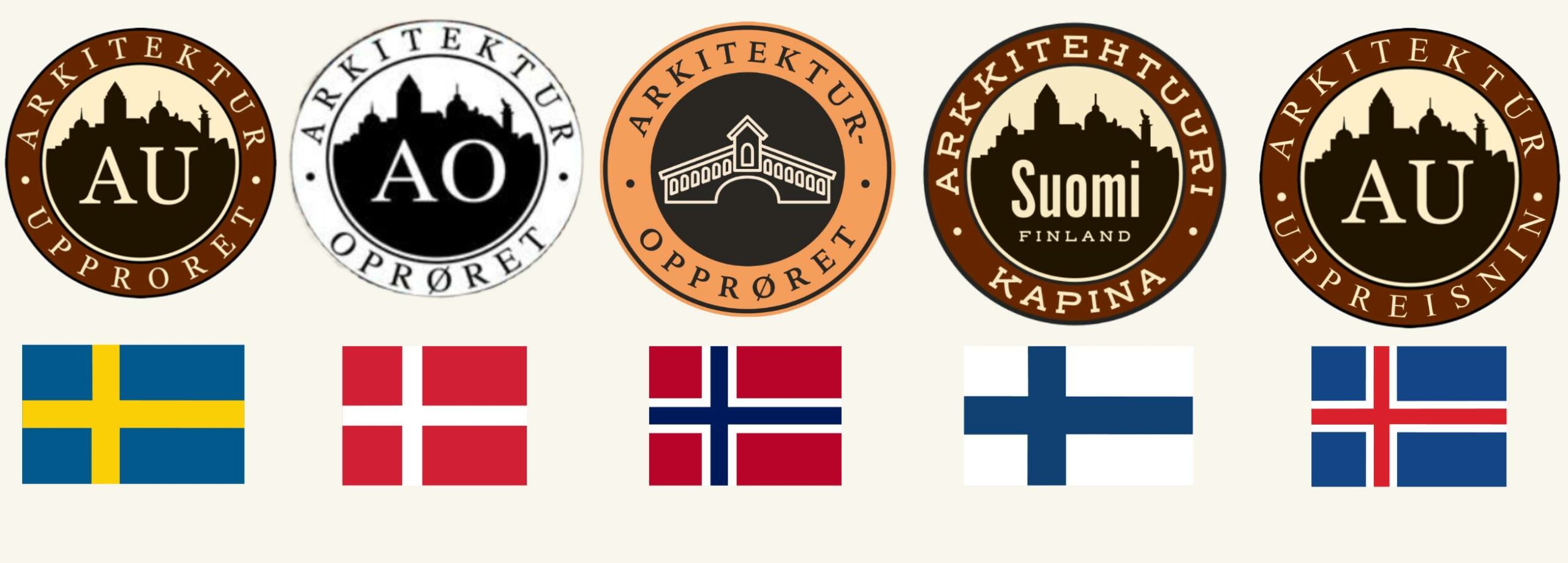
The MAMINNA prize is given in two categories: Master, the building voted most beautiful and Monster, the building voted ugliest. Each country has one nomination in both categories. Their nominations are the buildings the public in their countries chose in 2021. The first public voting period of the MAMINNA prize was from February 6th to March 17th with a total of 7476 votes. Click here ro read more about the voting.

The history of the new prize
Since 2016, Sweden has been voting for the most beautiful and the most ugly new building in a public vote called ”Kasper Kalkon”. After six years this prize has drawn more attention in media than the famous Kasper Salin prize from the Swedish architecture organization “Sveriges Arkitekter”. This is probably due to their prize being so predictable. Consistently, for over 60 years, they have only awarded their prize to gray concrete boxes void of architectural finesse. Not even once has any other style than modernism been awarded the price, let alone been allowed to compete. On top of this, there is no public vote for the winner. Instead, they let a small elite jury full of self-congratulatory friends, upcoming wannabes, and former colleagues choose the winner. Previous winners join the next year’s jury and almost every time they nominate architects from the previous jury members. That is why a new prize was needed not only in Sweden but also in Norway, Denmark, Finland, and Iceland, who all have similar problems. Why should a small elite decide what is beautiful?
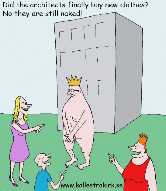
The winner will receive a golden statue
The winners of the MAMINNA prize will also be presented in media on April 7 and at the Swedish architecture gala. The winning architect of the MAMINNA Monster award (ugliest new building) will receive a statue made by the Swedish artist Mikael Grahn called ”Skaparvånda” (creative anguish). The winning architect of the MAMINNA Master award (most beautiful new building) will receive a framed certificate.

Presentation of the final result
Below you will first see the 5 most ugly new buildings and then the 5 most beautiful. Click here for a PDF of the MAMINNA prize results.

The Monsters of New Nordic Architecture –
The MAMINNA Monster award
Nr. 1. with 2544 votes
SWEDEN, Liljevalchs +, extension to the old art gallery on the Djurgården island in Stockholm
Builder: PEAB
Architect: Gert Wingårdh
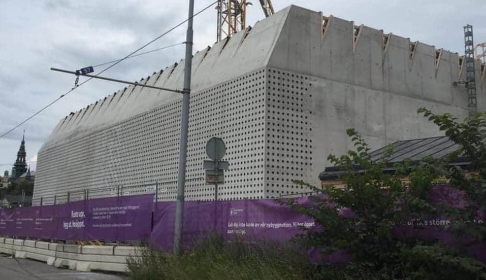
Click here to read about the Swedish public vote. Gert Wingårdh won the Swedish public vote with an impressive 3 595 votes out of a total of 12 154, and now, he has also been crowned the winner of MAMINNA Monster award with 59.3% of the votes. Liljevalchs+ caused total outrage in Sweden when it was built. The building is an extension to the Liljevalchs art gallery on Stockholm’s Djurgården island. This controversial building has been compared to a bunker, an egg carton, an above-ground basement, a concrete block and a giant car battery. It fails to harmonize with the surrounding historic environment and creates a bland, sterile and inhuman environment. This being a public building, the public had no say in the design process or what it should look like at all. Instead, they have to live with a building designed according to architect Gert Winghård’s idea that a building should provoke. It will be a provocation that will unfortunately likely last up to a century. Wingårdh has truly outdone himself this time, and, as he has stated in various interviews, he is very proud of his achievment.

This bunker-like pastiche is a macabre concrete block, with perforated holes which resemble the bottom of a bottle. Or as it is described by the now indecently cherished architect Gert Wingårdh himself: “an honest building” with “a light and playful expression that connects to Liljevalchs popular spirit”. We believe the building is rather built in the spirit of a traditional, Swedish glass recycling igloo. The building has received an extreme amount of criticism in Sweden, and it is widely hated among both politicians, celebrities and the public.

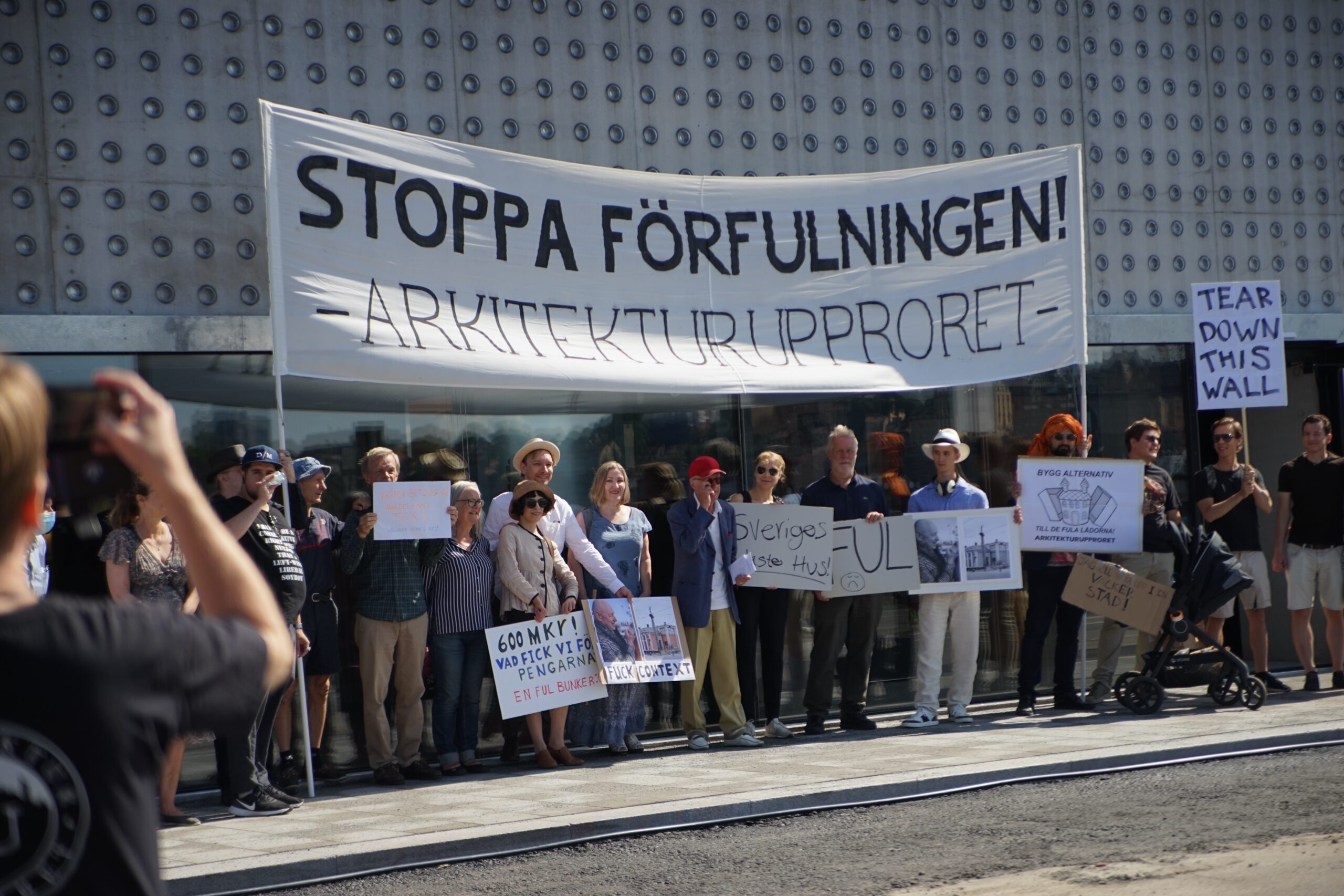
On top of this, Wingårdh’s bunker is already a financial failure. The costs have exceeded half a billion Swedish krona and the bill has been sent to the taxpayers. The cost of Liljevalchs+ is now at 570 million Swedish krona, which is 130 million Swedish krona more than initially estimated. As the extension is funded with tax money, every single Stockholm resident has donated about 600 SEK each to make Wingårdh’s wet concrete dream a reality. Read more about that here. At the opening ceremony, hundreds of people from the architectural uprising came to demonstrate against the uglification. We booed so much that the architect Gert Wingårdh could not hold his concrete celebration speech.
The architectural uprising was told by an insider, that the building was pushed through in the Liljevalchs architecture competition. This is thanks to Wingårdh’s self-congratulatory friends, upcoming wannabes, and former colleagues. It was also decided in advance that the extension should be ugly. Click here to read more about that. Meanwhile, the public had no say in what their public building should look like.

As we present this well deserved award, our condolences go out to the people of Stockholm. Provocation and ugliness are not a thing of pride. We hope Gert Wingårdh does not see pride in going against what the people want. Gert Wingårdh, a monster of New Nordic architecture.
Nr. 2. with 1232 votes
NORWAY, The Munch Museum Lambda in Oslo
Architect: Herreros (also known as Horroros)
Click here to read about the Norwegian public vote.
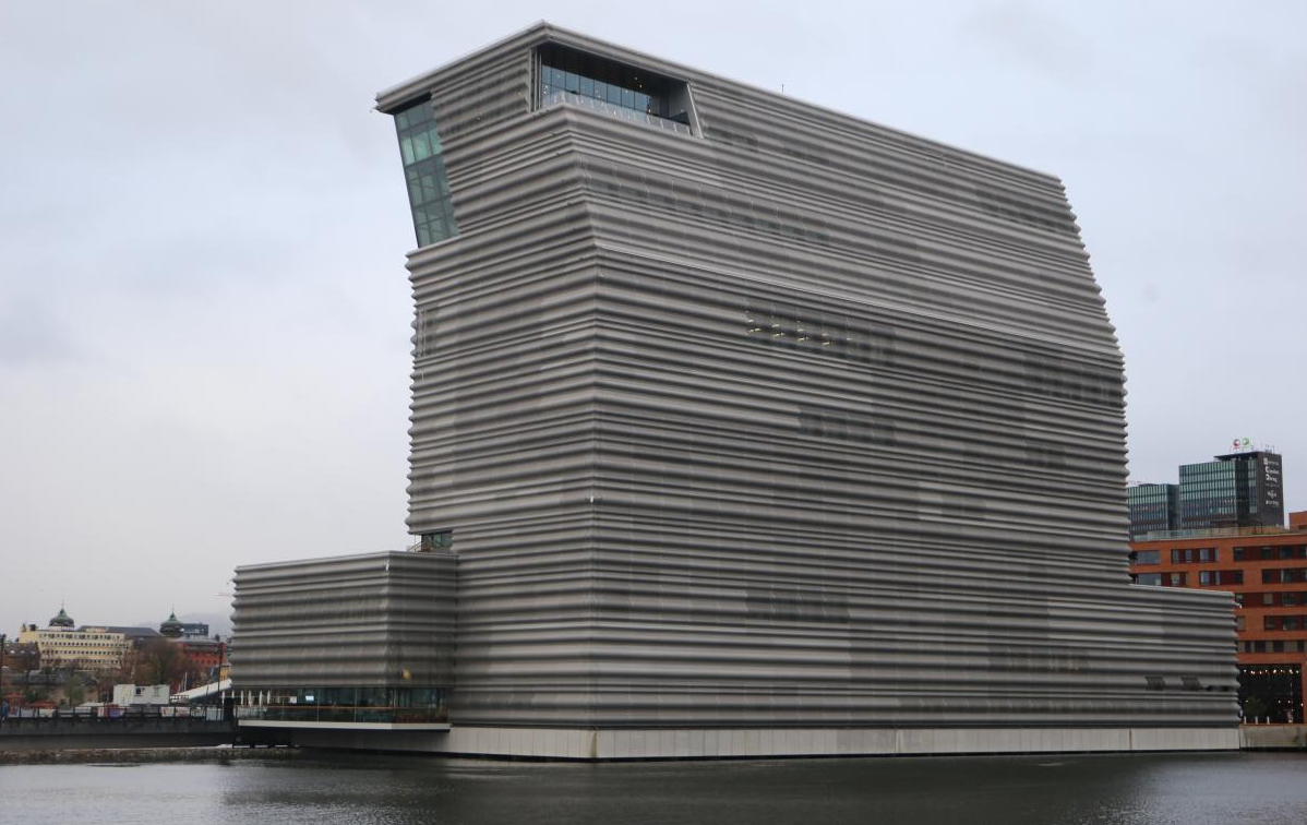
“The Munch Museum is so ugly that it makes you sick. It is unbelievable that the art of the most beloved Norwegian painter is placed in such a repulsive, huge public building”, said one of the representatives of the Arkitekturopprøret, Saher Sourouri. Arkitekturopprøret is a popular movement that fights for more traditional architecture in Norway. More than 11,000 people took part in the vote, choosing the ugliest and most beautiful buildings in Norway out of ten candidates. The organizing committee originally received 300 to 350 proposals, from which it shortlisted.
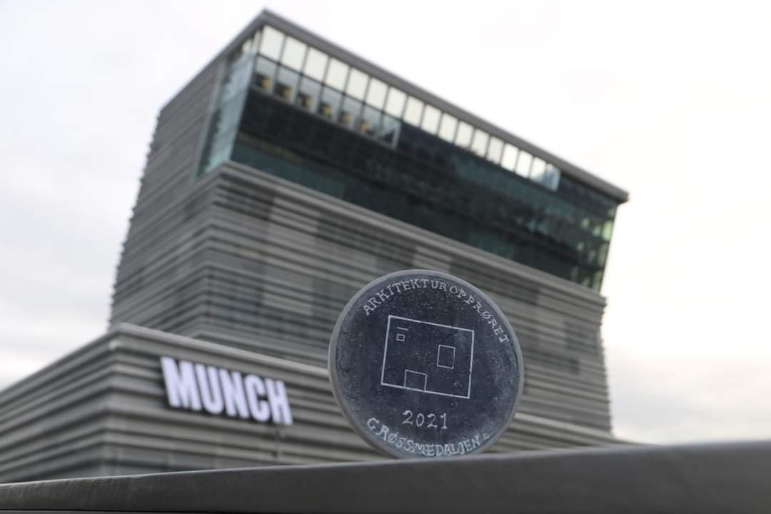
The museum building called “Lambda” stands on the shores of the Oslo Fjord and offers visitors five times more exhibition space than what was available at the former Munch Museum in the Tøyen district. You can also see various versions of the artist’s most famous work, “The Scream”.

Although the creation of new space for the exhibition of works by one of the world’s most famous artists was needed and welcome, the new modernistic building with a striking bend resembling the Greek letter, designed by the Spanish studio Herreros (also known as Horroros), has been the target of much critique. “The lobby looks like an airport, warehouse, hotel or commercial building” said art historian Tommy Sørbø, adding “there is nothing in the choice of colors and materials to suggest that this place is home to one of the world’s greatest artists”. The manager of the institution is of a different opinion. According to him, the museum must provoke, just as Munch’s paintings did in their time. He means that an ugly building gets more attention than a beautiful building that blends in and hamonizes with its surroundings. Positive or negative attention does not matter, as long as a building gets famous. This is a common opinion among modernistic box architects.

Nr. 3 with 265 votes
FINLAND, Keski-Suomen Sairaala Nova in Jyväskylä
Builder: SRV
Architect: JKMM Arkitekter
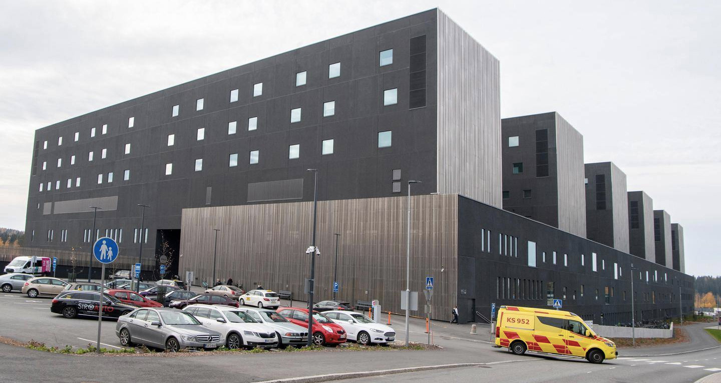
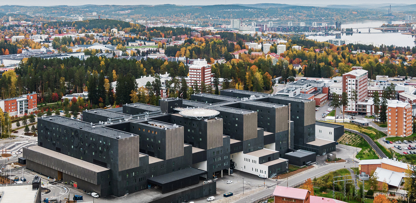
The front-runner in the Finnish Architecture Uprising “Fuulandia of Architecture 2021” anti-award public vote was given to the new “black cube of death”, also known as the Hospital Nova in Jyväskylä, or Keski-Suomen Sairaala Nova.
The award going to Nova was not a surprise, as the hospital has been a recurring theme in AU Finland’s posts throughout the year. One might argue that a new hospital doesn’t necessarily have to be among the most beautiful buildings – or maybe that’s precisely what it should and needs to be? One thing is for certain, it should not live up to the very definition of the gates of hell!
How can you expect to be cured of your ailments going into what is essentially an ugly, black shoebox that is the very epitome of contemporary modernism? As the saying goes, “Modernism is something you do to other people”, and this building is a true testament to this.
Is this the future of architecture? It might be, unless people speak up for Architecture Uprising in order to get aesthetics back from the monopolists’ to the people.
Nr. 4 with 131 votes
DENMARK, Lilli Gyldenkildes Torv in Horsens
Builder: CASA
Architect: ARKITEMA
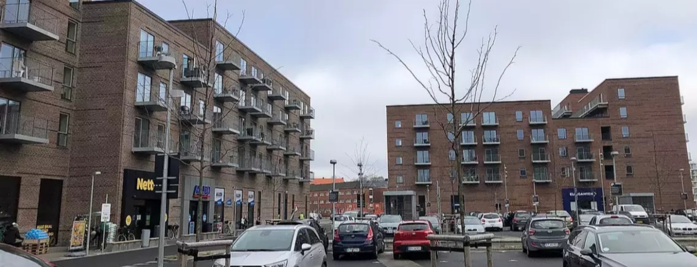
Lilli Gyldenkilde’s Torv in Horsens, Denmark was designed by ARKITEMA Architects in Copenhagen for the construction company CASA on behalf of the housing association LEJERBO. Even though it is situated in the center of a medieval city, it signals suburb dreariness and gloom. Following the victory in Arkitekturoprøret’s public vote, Danish public TV and radio channels produced transmissions about the failed building project. However, the owners LEJERBO seem rather satisfied with the project.

Nr. 5 with 115 votes
ICELAND, Austurhöfn in Reykjavík
Builder: Mannvit
Architect: T.ark arkitektar
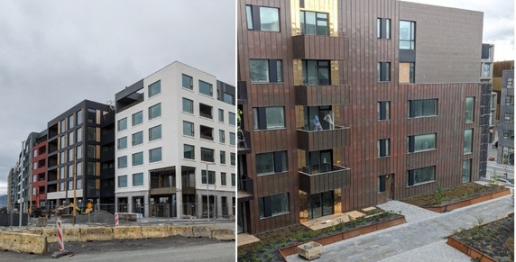
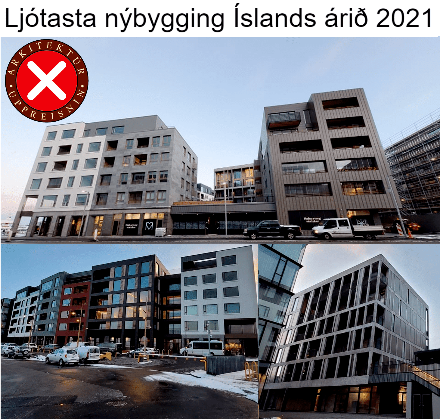
Austurhöfn is a new area of downtown Reykjavík that is built on top of a landfill near the old Reykjavík harbor. The area is a collection of buildings that form one whole. The new buildings are highly controversial in Reykjavík. Members of AU Iceland have described Austurhöfn as soulless, gloomy, and sterile boxes that overshadow the neighboring environment and do nothing to beautify the city. The project’s architects are T.ark arkitektar and construction was led by Mannvit.
Masters of New Nordic Architecture –
The MAMINNA 2022 Master award
Nr. 1 with 1281 votes
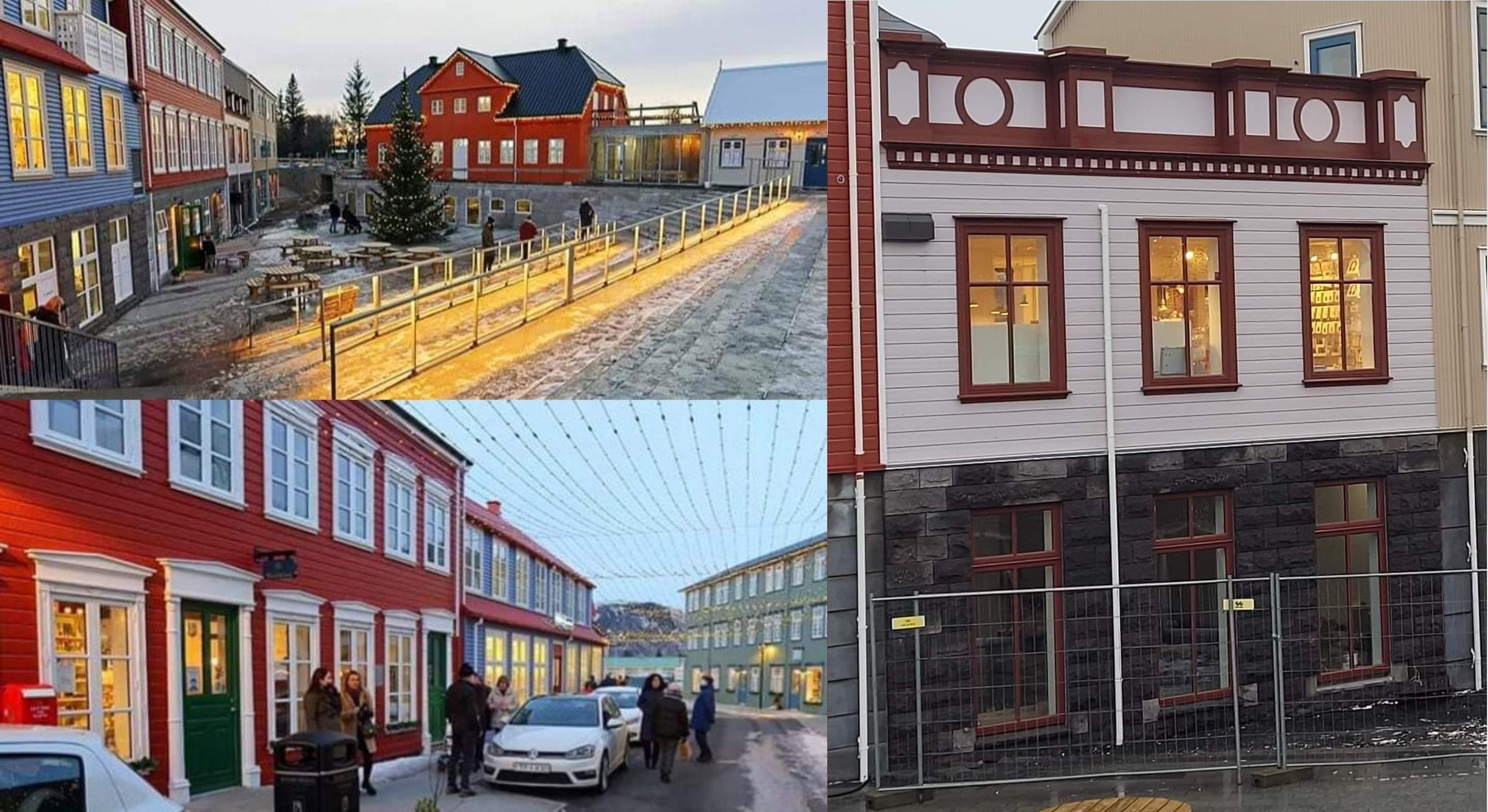
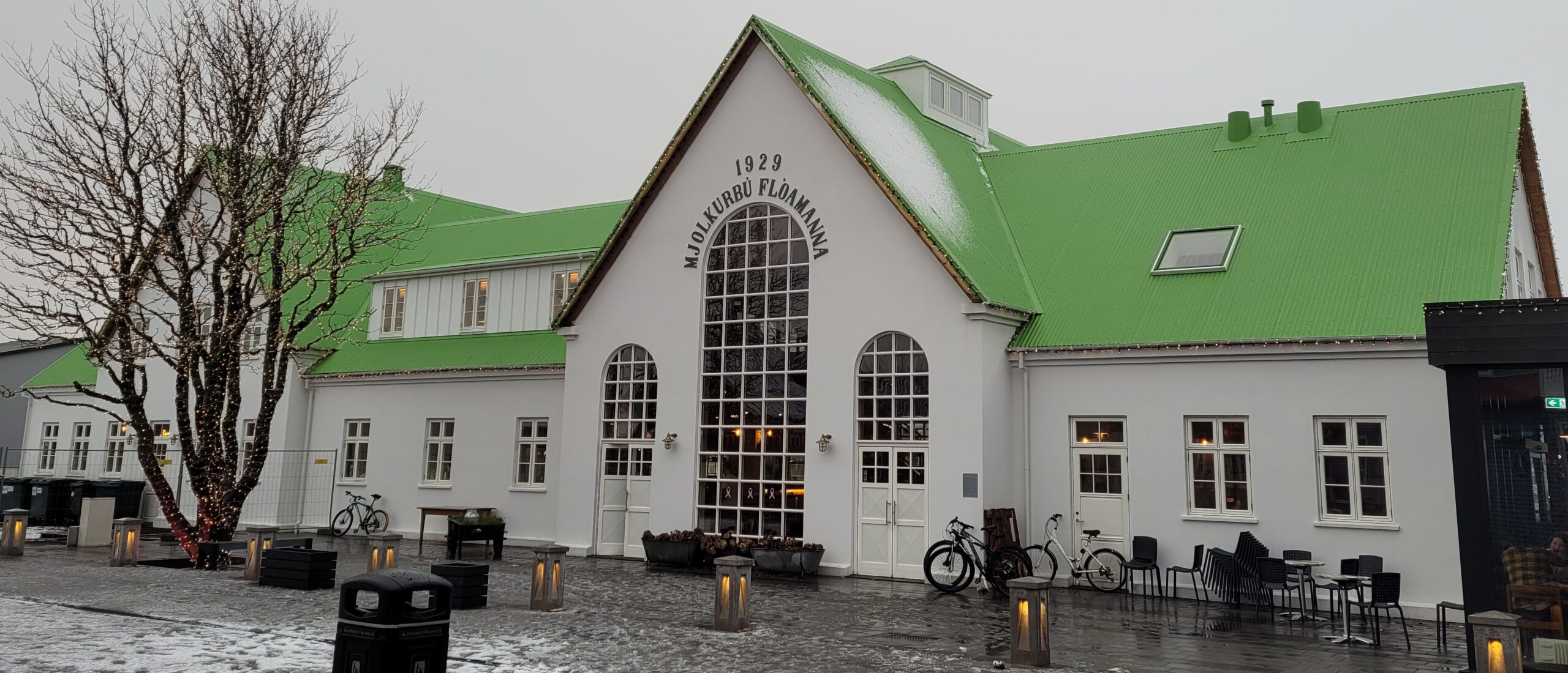
ICELAND, Mjólkurbú Flóamanna in Selfoss
Architect: Batteríið
Developer: Sigtún
The building voted most beautiful by the public with 40.2% of the votes is the market-hall Mjólkurbú Flóamanna in Selfoss, Iceland. This new building is located in the heart of Selfoss and is part of a building project to construct a new center for the town. All the buildings are either inspired by or reconstructions of historical buildings all over Iceland that have either been lost to fires or demolished. Mjólkurbú Flóamanna is truly a centerpiece of the project.
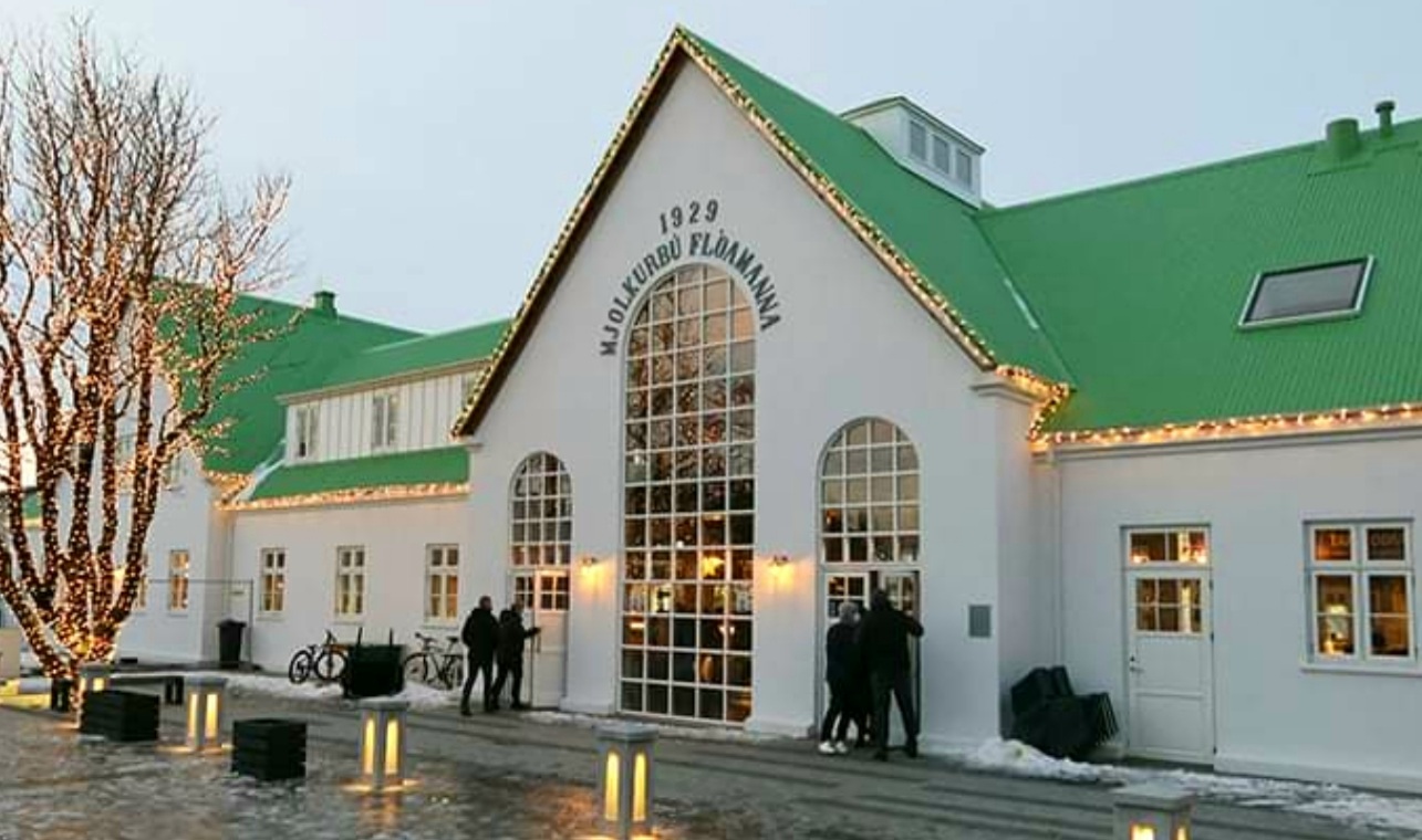
It is one of the first things people see when driving over the Ölfusárbrú bridge towards the center of Selfoss and gives both visitors and locals a warm welcome. The building houses a food hall and a skyr museum which brings much needed life to the area. The new town center of Selfoss has attracted many visitors to the town and people from all over Iceland travel to Selfoss to experience a beautiful new town center that fulfills people’s preferences for traditional architecture. It is with great joy that we present this award to Batteríið. Our congratulations go out to the people of Selfoss.
Nr. 2 with 1144 votes
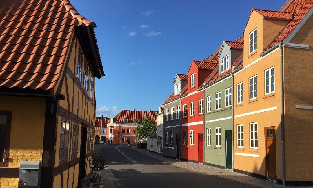
DENMARK, Rækkehuse in Svendborg
Architect: C&W Arkitekter

Kullinggade 3-5-7 in Svendborg, Denmark was designed by C & W ARKITEKTER of Svendborg for Kullinggade 3-5-7 APS. These four small houses are well adapted to the surroundings, consisting of old buildings. They also add aesthetic value that any modernistic building never could.
Nr. 3 with 331 votes
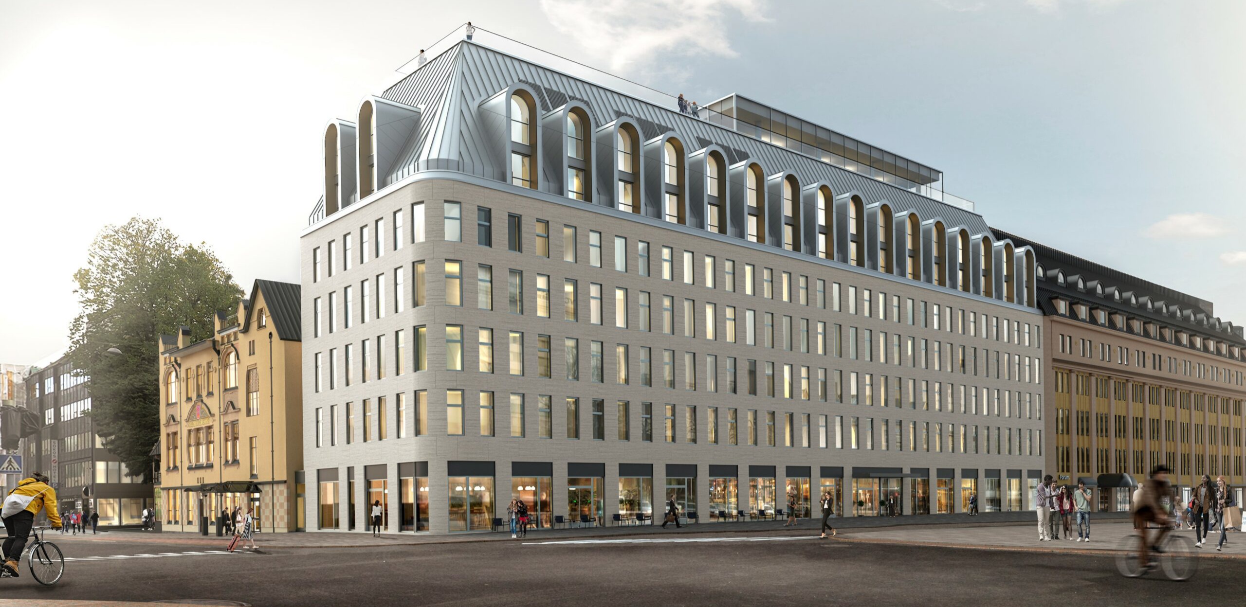
FINLAND, Scandic Hamburger Börs, Turku / Åbo
Architect: Schauman Architects
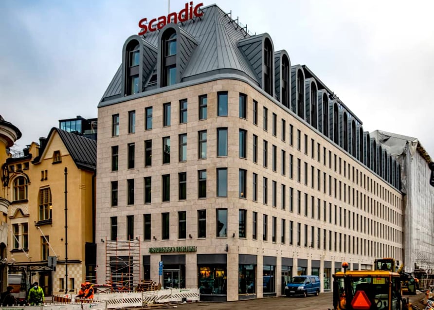
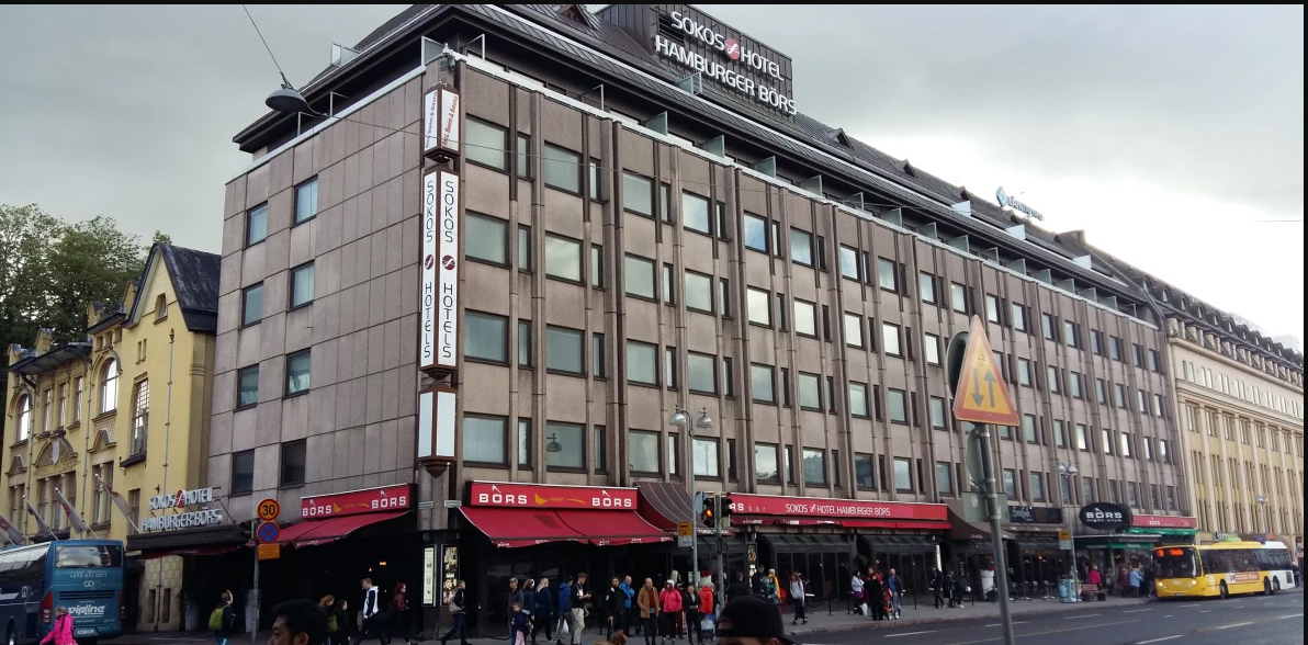
The Scandic Hamburger Börs, designed by Schauman Architects, replaced an ugly 1970:s hotel building. The round corner and roof with clear influences from art deco give this building a sympathetic look. Although the windows are quite monotonous, this is still an improvement from most of new buildings today. The Photoshopped image below shows what the building probably would have looked like if Finland wasn´t of the first countries in the world to start an architectural uprising!

The picture below shows the building that was demolished to build the new hotel. Could this be the first building in the Nordic countries post 1930 to be replaced with something more beautiful than what was torn down?
Nr. 4 with 276 votes
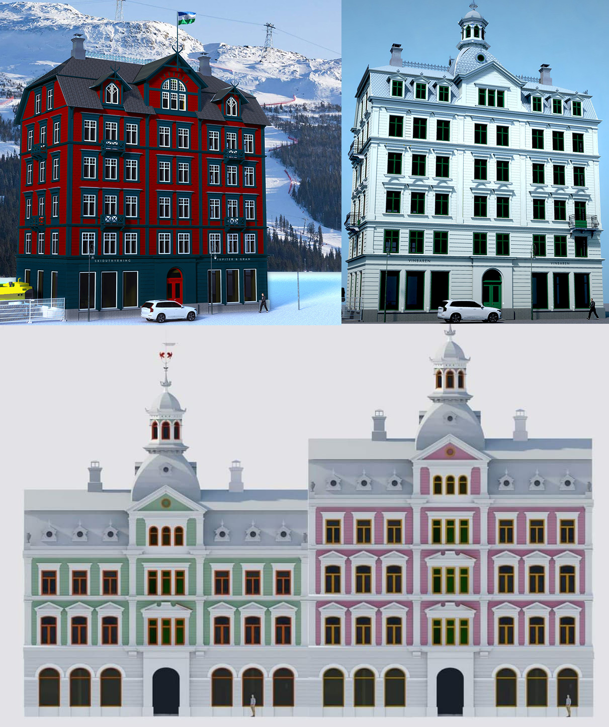
SWEDEN, Jupiter & Gran carpentry hall, Sundsvall
Builder: Jupiter & Gran
Architect: Tradition Arkitekter
Click here to read about the Swedish public vote. Jupiter & Gran are currently planning to mass-produce houses built with wood. The houses will be available in different sizes and colors and they are currently in the process of purchasing a lot to build the first 4-6 story building in Åre or Stockholm. Click here to follow the hyped developer Jupiter & Gran on Facebook!
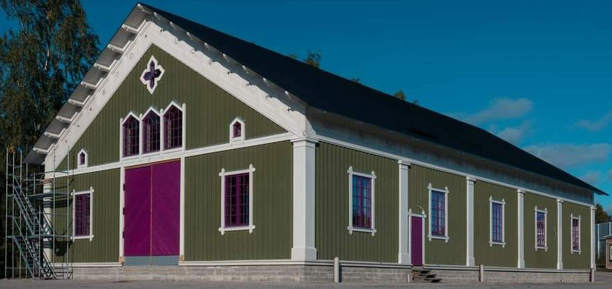
The first prototype building is already under construction and in a few years, hopefully, you will be able to see these buildings all over Sweden inspired by traditional Scandinavian architecture. Until then, their beautiful carpentry hall built in 2020 in Matfors, outside of Sundsvall, will have to suffice. This building won the public vote of ”Sweden’s most beautiful new-build 2020”. As such, Jupiter & Gran’s projects are well deserving of some extra attention and as soon as there’s a free lot and a client, everything is ready to go and we’ll be seeing this type of buildings even elsewhere.
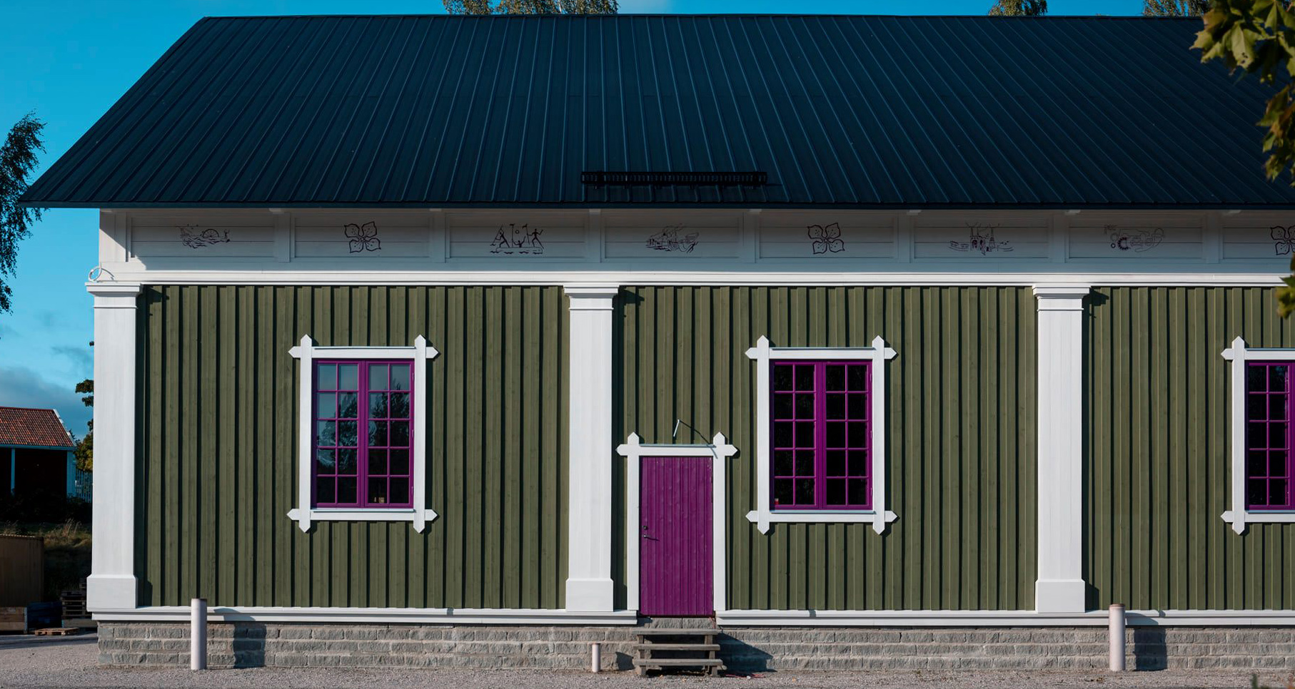
On their homepage, they write “We build detached apartment buildings or cohesive neighborhoods based on the same genuine, wood frame and consistently use organic materials. Our construction foundation is designed to allow for houses varying from two to five stories, with a variable number of apartments from three to five per floor, and with the possibility to adapt floor plans with ceiling heights starting from three meters or more. Our basic philosophy is natural and genuine.”

”We develop our collective professional knowledge and always let the joy of creativity make a mark on every house. Depending on the location and the wishes of the client, the houses are adapted with towers, balconies and verandas, color scheme, paintings, fragrances, choice of materials, and also local adaptations. On the ground floor, there is always room for different businesses – that’s how we want to build living and inspiring neighborhoods.”

Below you can see what kind of houses Jupiter & Gran are planning to build in Sweden. Now all they need is a first buyer. Do you happen to have some land available in any Scandinavian city? Just let them know! 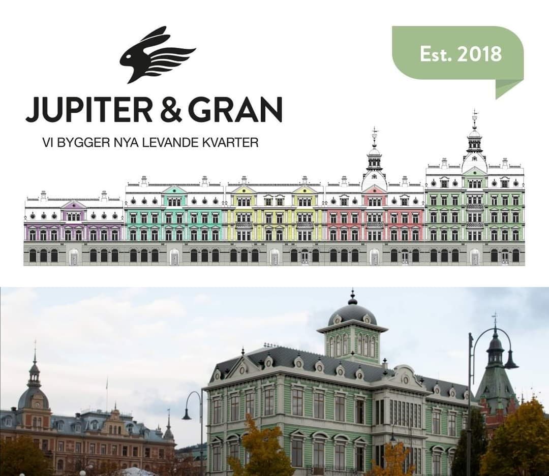
Nr. 5 with 162 votes
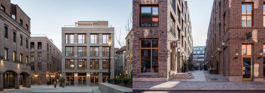
NORWAY, Nygaardaplassen, Fredrikstad
Architect: Mad architects
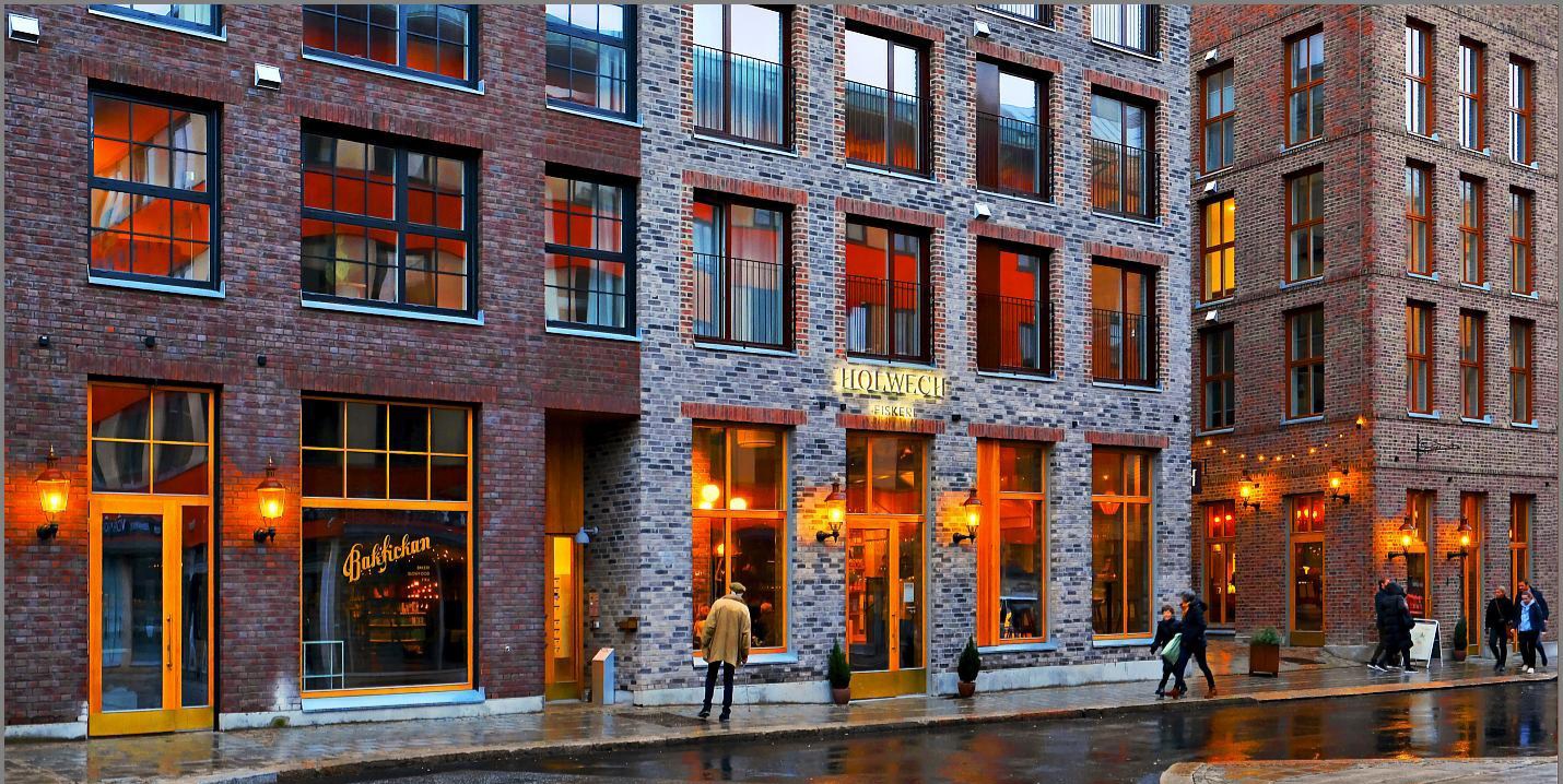
Click here to read about the Norwegian public vote. Built in place of a parking lot in the center of the Norwegian city Fredrikstad, this neighborhood draws its primary inspiration from Brooklyn, New York. The architects, however, opted for scale that works better with the human sentiment, adding warm materials and a great deal of variety. Thus, they revitalized an empty lot into an inspiration for numerous similar lots around the country.
More information about each Nordic country’s public vote
- Click for Sweden
- Click for Norway
- Click för Denmark (most beautiful new building)
- Click för Denmark (most ugly new building)
- Click for Iceland
- Click for Finland

Very good exemples for good and bad arcitecture!
For bad exemples I did the same in Berlin, all together in my new book:
’ARCHITEKTUR FÜR DEN MENSCHEN? Eine Wahrnehmungsschule am Beispiel Berlin’, EuropaBuch Verlag